Posts

Photoshop Tutorials

Photoshop tutorials  In this tutorial it goes over the basic tools of photoshop beginning with how to create a new document. The instructor explains how to create a background layer and then you can bring in an image by dragging it into the platform or opening it in the platform as well. Once you drop in an image, you can skew and crop size the image. You than need to rasterize the layer to edit it. The instructor also explained the filter, adjustments and edit tabs at the top left and the effects that they can provide for an image. The interesting thing the instructor decided to go over was the difference between Vibrance and Saturation. Vibrance is changing all colors except skin tones, while the is Saturation all colors. The hardest thing to understand was all the control shortcuts the instructor went through; however they will be very useful in the future.  In this photoshop tutorial , the instructor goes through 10 simple steps to starting photoshop. He begins by explain...

Propaganda Poster

Image
Propaganda Poster   My Image  My Self Portrait  Artist Statement When making my propaganda poster I started with creating my self portrait. I chose an image that had my full face and smiling so that I could play with the shading and out line along with adding emotion in my image. When outlining my image I used the pen tool to trace half of my face. After tracing the other half of my face I outlined areas on my face that held some shadows or were more well lit in my image. I than chose to fill my face with different shades of blue to represent where the shadows are and what side of my face was facing the light source. After doing the same for my hair I moved on to making my poster. I decided to use yellow as my background to contrast the blues and then create flowers. I made the flowers from using the ellipse tool and going to the edit tab then choosing “pucker and bloat.”  I duplicated the layer of the first flower and changed the color rotating it to make it lo...

Self Logo

Image
 My Logo  Colored Black and white  Sketches Artist Statement My logo was inspired by the things I surround myself with that I love. In my sketches it started with a central focus on the earth.  In an effort to maintain a minimalistic style with the most amount of elements I decided to pick symbols of things in my life through things that make me happy. I used a light bulb as the base of my sketch. I love string lights in outdoor settings because I feel they illuminate warm energy and bring comfort to the area. I use the light as a symbol of creativity. Inside the light bulb, I chose to do a wave and the sun. The sun is a symbol of positive energy. Whenever I am having a bad day, being able to watch the sunset is my way to center myself at the end of a day. The wave is a symbol for life. Growing up living near the beach, I associate my family with the ocean and my home.  When creating my image, I used the pen tool to draw one side of the light bulb and than mirro...

Calligram

Image
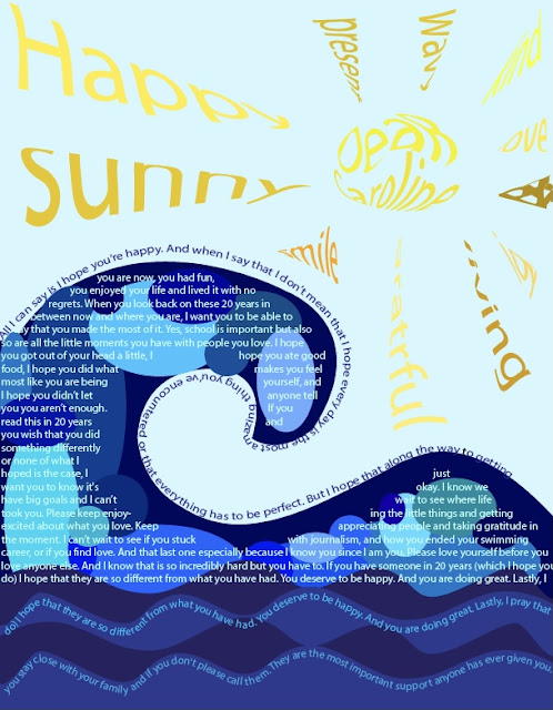
My Calligram  When creating Calligram, I started by writing my letter to my future self. 20 years from now is a long time,  but life moves really fast and I feel like in 20 years I will have fel like I wrote this yesterday. That I why when writing this, I though about everything that has happened to me leading up to this point. What I have loved, what I regret, what I would change, and what I am thankful for. That was something I considerd when deciding what art I wanted to create with my words.  I used the Pen too to draw the ouline if the wave. Once I did this I used the type on line tool to allow my first sentance to follow the path of the wave I than outlined the wave with the pen tool and than used the type to area tool to fill in the wave with the rest of my text. I wanted yo make it a little more abstract so I added waves with the pen tool and circles to fill in the shape of the wave and add some motion in the image. The the sun being so important to me in my daily...

Illustrator Tutorials

Illustrator Tutorials   https://m.youtube.com/watch?v=3GzumUieDPY In this video it highlights the basics of Adobe illustrator. It starts by covering the basics and the commands that you might use. It then informs the reader about the possible tools on the side bar that will help you create your art. Curvature tool seems fairly harmful to use because the curvature is similar to a pan tool therefore I feel like I might mix up the two of them. However this video did cover quick tips on how to use it such as clicking a point if you want it to be a straight line. https://m.youtube.com/watch?v=JfRdZdRgKvQ In this video it teaches the viewer how to use the guides and rulers in Adobe illustrator. This was something I wanted to learn how to do because I realized this will be super beneficial when creating my art. By using the rectangle tool, you can help skip having to use math because you can base your guide measurements off of the rectangle width. When finding where to place yours seems l...

Canvas Project

Image
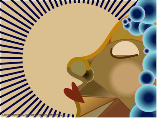
Final Composition  In my Canvas Project, I wanted to create abstract minimalist art. That is why the image combines a series of shapes and curves in order to form a simple face. My work was inspired by my Pinterest page and how I wanted to connect my piece to an aspect of my life. My personal taste in art is abstract and minimalist images. Abstract art holds a complexity to it that I feel gives the artist the ability to express themselves in a way that lets so many different elements in art come together to form their final product. Whereas minimalistic images do the opposite, they use the least elements to give their message. While these styles can be very different, my goal was to combine them since they have had such an influence in my artwork throughout my life.  I began by drawing the outline of the face with Bezier curves and quadratic curves. This was also used to make the lips for my face and the closed eye. Although these shapes may seem like common sense when making...