Posts

Final Portfolio

Image
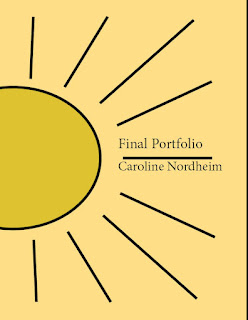
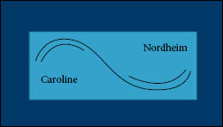
Final Portfolio Artist statement  To end the semester, my FMX 210 class submitted a final portfolio. After putting this together I like the consistency my work has throughout all of my projects really stood out. My art maintained a minimalistic abstract style, which was my goal when creating it. I was also able to use symbolism in each of my pieces rather that be represented through a wave, the sun, colors, or style choice all of it had meaning when I was making my pieces. That is why when making my art, I wanted it to hold meaning to me so when I put my portfolio together, I could see the connection everything had to each other. One of my favorite parts of making my art work was picking the colors especially when we made our logos. I love the symbolism certain colors have and when making my art work colorful, keeping the a conscious effort to pick colors that emphasize the message I am trying to have my work send really allows me to appreciate what I make more.  In FMX 210, the class

Business Cards

Image
Business Card When creating my business cards, I wanted to stick to a common theme I had used throughout all of my art up until this point. My love for the sun and sea has been constantly represented in all of my work throughout each of my projects during the semester. That is why when making a card for my business, I wanted it to be representative of my work and the symbols I use as a reflection of my identity in my art. I use a wave when resembling water which I consider an ongoing theme in my life. The sun also holds a lot of meaning to me which I why I though it would make a good center piece in my work.  I started by creating the templates for my business cards and finding the colors I wanted to use for each of them. I used the pen tool when drawing the wave and water. The rectangle on my abstract card which I thought I could make a cool layers effect with. I used the ellipse and line tool when making the sun for my vertical card and put the text in the areas where I feel it could

InDesign Tutorials

  https://m.youtube.com/watch?v=iHDy_nEvgd4 This tutorial covers the basics of InDesign by starting a project from start to finish.  The video begins with an introduction of the 3 step process: Step 1 - Preparation, Step 2 - Implementation, Step 3 - Finalisation. Then it covers how to set up a document and explains how the program works. This tutorial is the first one in a series therefore the coverage of material is mainly related to what the program is. The adobe platform indesign is made for print, therefore mainly used when making things such as, brochures, leaflets , and business cards. The instructor went over scenarios where you would use indesign and when you would use different layout styles.  https://m.youtube.com/watch?v=AshfNo-i8Ws In this tutorial, it goes over all the tools that are in indesign. It begins by differentiating the Main selection tool, which moves shapes, and the Direct selection tool, which moves points on the shape.The text tool what is reviewed next. If yo

Somewhere

Image
  Somewhere I photoshopped myself into this scence of of the Movie Hot Rod. The reason I chose this movies is because I was thinking about the movies I have really enjoyed watching. Hot Rod is a comedy movie which is my families favorite genre to watch together. My brother’s favorite movie is Hot Rod which is why I found the idea of photoshopoing myslef into one of the scences would be funny to do.      I started with picking a scence from the movie I felt I could make myself look natural in. I thank took an image where I was in motion because I wanted to make myself look like I was moving in the background. I than cut myself out of the image I took and used a layer mask in order to take out or bring back in different parts of the image I may have messed up. I added adjustemnt layers to the image of myself because I wanted to match the quailty of the image I was putting myself in. I used the curves and saturation to try an match the colors in the scene around me. 

Photoshop Homework 2

Image
I am choosing to photoshop myself into this still frame from the movie Hot Rod. I think that this image on Kirby Jenner’s instagram would be the hardest to photoshop myself in because blending the water into the image seemed the hardest one to do. There are so many elements in this image along with the lighting of a studio photo that Kirby has to work with making not only photoshoping the water in difficult but also making sure he matches the image. This image on AvergaeRob instagram inspired the idea to use a scene from Hot Rod for the "Somewhere" project. The dumb humor that the movie has matches the energy that this image gives me. I laughed when I saw him standing next to this bike reminding me of how I laughed when I was watchinhg the movie.           I found this image really funny because it seemed the most genuine. After seeining all the effort that went into photoshoping what people asked for in a way they wouldn’t expect, the simplicity of just zooming into this kid

BW to Color

Image
  Monochromatic   Split Complementary  complementary   My image   When creating my black and white to color assignment, I started by selecting different areas of the background that I wanted to color. I than proceed to do this with all parts of the image. After selecting the areas, I made a layer mask, which allows me to color the specic areas that I selected. I chose to make copies of each of these layers with the masks I made in order to allow myself to edit each of them based on the set of color rules I chose.  I choose to do monochromatic, split complementary and complementary color rules for my coloring. My favorite color is blue and begie thats why when I found that some of the color coordianted with each other I wanted to use those specific pairs. I did my best to pick the colors I also found the most asthetically appealing. 

Tag Brush

Image
Tag Brush When making my tag brush, I wanted to incorporate as many elements that related to my logo as possible. I choose the splatter for my logos background that most closely reminded me of an ocean spray since my logo featured the beach. I than allowed that scratches to add the element of fade making my logo have a vintage feel to it. When we were told to use our logo to create art I tried to use colors that resembled parts of my logo. I used yellows orange and red to try and resemble a sunset. I used blue above to make it seem like the sky and dark blue underneath to make it seem like the water. I tried to make a connection back to the black and white by using that in the center of the colors in order to make it feel like the images tied together. I also wanted it to be a symbol of colors breaking through the darkness even though white is not a dark color.